Vintage Stamps: Pink & Gold

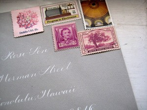
I was writing a thank-you letter to my grandmother and put together this gray envelope with white calligraphy. Originally, it just had gold/yellow stamps, but I added in some pink and thought about how pretty and feminine a color combination pink and gold is.

L to R: Dahlia from the “Roses” block (all pink Scott 1876-1879); Progress in Electronics (Scott C86); Edgar Allen Poe (Scott 986); Library of Congress (Scott 3390); Connecticut (Scott 772). This envelope is, as I said, a thank-you note, so while I think it could work splendidly for weddings, you could also go with something a little more refined with the color scheme and do gold calligraphy on white with pink stamps or vice-versa, or black calligraphy on a pale pink envelope with gold stamps. A couple more stamps that fall into the color scheme:

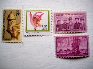
L to R: Puerto Rico (Scott 1437); Orchids (from the Orchids block–3 are pink, one is yellow: Scott 2076-2079); Armed Forces Reserve (Scott 1067); 300th Anniversary of New York (Scott 1027). Gold is a bit harder to find (provided you don’t want to use Christmas stamps) than pink–pink you can find almost anywhere, particularly in the older stamps at smaller denominations.

…And my favorite, which I don’t have anymore–Emily Dickinson may have been a 19th-century poet, but this stamp looks so 50s to me–which is sort of the essence of pink and gold:

(Scott 1436)

Posted in Design, Paper, Weddings | Tagged , , , , , , , , | Leave a comment

Ruins

Nothing like some juicy ruins to get your emo on.

We drove out to Muttontown (which, despite that quaint moniker is quite the posh North Shore town–when you’ve got like, five equestrian centers in a two-mile radius, you’re not mutton so much as rack of lamb) which has a nature preserve, complete with forests, ponds, meadows, and…ruins. This of one of three remains of Knollwood–a once-huge palatial estate owned by King Zog of Albania, who paid for it with a bucket of diamonds and rubies amounting to something like $103k in the early fifties, and has since been burned, looted (although nothing was found), razed to the ground, and was the site of a 2001 murder of a 35-year-old woman.

Long Island–whodda thunk it?

By the time we got to the ruins, we could examine them, but not really hang out because we needed to get back before the park closed–otherwise, I could have sat on the wall and wrote all kinds of bad poetry. Just as we got back to the car, the clouds rolled in and it started to rain, one of those classic summer rain storms with thunder and everything. And I swear, I actually wished that I could have been back at the ruins, having an aesthetic experience in the rain. Like a Meatloaf video.

(For reference, Muttontown Preserve is off of 25A (Northern Blvd.) in East Norwich on Long Island)

Posted in Inspiration, Musings, Travel | Tagged , , | Leave a comment

Clichés of Wedding Photojournalism

Back in the seventies and eighties there was a photography convention that was all the rage. My future mother-in-law has pictures like these (unfortunately, I couldn’t procure them for the blog, so I’m using others’ examples)—perhaps your parents do too. What is it? Why the fab-yoo-luss double-exposure, of course: 

Source: perardi's flickr stream (http://www.flickr.com/photos/perardi/2353652716/)


How artistic and sophisticated and cool, right? 

I’m not sure where the trend came from, but when I googled “double-exposure” there was a lot of mention of 70s/80s album covers, so perhaps it was a broader media-marketing trend that made its way into private use—as is common with a lot of trends. Including—dum-da-dum-dum—today’s wedding photojournalism. Which is something that I agree, looks so fabulous and chic and smart today and therefore I predict will be precisely the kind of thing your kids will laugh at in fifteen years. I can hear it now: “Mom, what was with you guys in the millennium? Why did everyone take pictures of their shoes??” 

Source: photograph by Viera Photographics via http://www.stylemepretty.com (I cropped it)


Now, I say again: I love photojournalism. But let’s not kid ourselves. We’re in a peculiar place with weddings where everyone is trying—desperately—to avoid being cookie-cutter; thus, there’s a strange paradox emerging wherein taking liberties with the old wedding conventions is now in itself conventional. Photography does not escape this. The crux of wedding photojournalism is that for a style that is supposed to be natural and celebrate spontaneity, it’s got artifice and clichés all of its own. And admittedly, it would have such clichés, both because wedding photography is a business and trends mean dollars but also because the American wedding has developed so many contemporary rituals, that even if the event is shot in photojournalistic style, no photographer’s going to skip the big kiss or the teary-eyed Maid of Honor. Nevertheless, there are a few that seem distinctly of the 2000-2010 vernacular: 

1. An engagement session that involves balloons: Bonus points (or penalty, depending on where you stand) if it’s one really big balloon and it’s pink. My guess is some photographer or couple used Lamorisse’s French film The Red Balloon as inspiration (which is a smart idea) and it caught on. It’s cute and playful, but the ‘00s big balloon is today’s version of the 80s Diana-inspired challah-sized puffed sleeves. And while not quite as common but cutting it close are engagement sessions involving bicycles, picnic quilts, or…(see #2) 

2. An engagement session that involves children’s books: Particularly if one of them is anything by Shel Silverstein and the other is Curious George or Little Blue and Little Yellow and you’re laying head-to-head on a park bench. 

3. The Reservoir Dogs groomsmen shot: This is when the groomsmen all wear sunglasses and fan out on the street like they’re some kind of black-tie gang of WASPs. 

4. The Pink Ladies bridesmaids shot: The female companion shot to the groomsmen Reservoir Dogs shot, only it may showcase flip-flops, colorful heels, and/or personalized hoodies instead of sunglasses. 

5. The visual synecdoche: I am not quite sure what this is about, but it suggests to me that a child or a very, very short person took the picture. Here are the bride and groom’s torsos (bonus if the groom has on a funky tie). Here are the bride and groom’s hands. Here are the bride and groom’s shoes (bonus if the bride is wearing Chuck Taylors or cowboy boots and if the guy is wearing sneakers or socks in flourescent madras)…Maybe the couple can make a kitschy collage with all the proofs after the honeymoon.   

6. A bunch of people, jumping: Because who doesn’t feel like jumping in mounds of taffeta, heels, cummerbunds and bowties? Boy, you must be really, really happy. And just so we know you’re green, flash a peace-sign while you’re at it. 

7. And gosh, it pains me to say this because I love it, but—Fisheye lenses: Oh, but you know that this is the exact reincarnation of double-exposure for the new millennium, don’t you? 

Ah, well. I’ll probably get all these done anyway–what’s progress anyway if your kids can’t laugh at where it all began? 

Say cheese! 

Source: photo by Max Wanger via http://www.greenweddingshoes.com (I cropped it)

Posted in Design, Musings, Weddings | Tagged , , | Leave a comment

Inspiration: Line Drawings

When it comes to 2D work, I find that people are either line or color people. It’s a stuffy distinction going way way back for centuries, but I think it’s true. NRM is a painting (color) person; me, I’m definitely a drawing (line) person. I collect children’s books and my favorites (for illustration, anyway) are inevitably the ones with the strongest line quality, those by Maurice Sendak, Shel Silverstein, Nancy Ekholm Burkert (Snow White), Ron Barrett (Cloudy With a Chance of Meatballs), and Ray Cruz, who did all of the Alexander series by Judith Viorst:

Those of you who know me know I’m a sucker for the seventies, and line drawings are so seventies to me (what could be groovier than Coke bottle shades in your sweet Beetle?). Case in point: Mollie Katzen’s Moosewood Cookbook, which debuted in 1977 looking like nothing else on the market with Katzen’s hand-lettering and hand-drawn illustrations:

Not like it ever went away, but line drawing has a hip crafty vibe these days. I see it a lot more.

This one’s (L) from the architecture/interior design book Bohemian Modern: Living in Silver Lake by Barbara Bestor, who is an uber-trendy architect and has been featured in the likes of Domino (RIP, sniff). It’s the sort of book that illustrates the kind of “bohemian modern” (re: hipster) cache you get with line drawings (and hence, it’s also the kind of book that makes you simultaneously admire the crazy beautiful homeowners and their crazy beautiful dwellings and hate them with green envy at the same time).

And then one of my very favorite posters (R) from one of my very favorite stores in Argentina, Papelera Palermo (si, they have a websiteen Español) –which, if you are into paper and ever down in Buenos Aires, get thee down to Palermo Soho and experience joy). Yes, the piece is risqué, but line itself has such a sensuous quality to it anyway.

Line drawings would, I think, make a really neato DIY save-the-date or invite to a more informal affair. These are a few drawings I did as a prototype sample for a friend’s wedding about a year ago:

I loved the idea of line-drawing so much back when I did these that I cannibalized my copy of Alexander and the Terrible, Horrible, No Good, Very Bad Day and lovingly framed my favorite shot. A year later, it still makes me happy at breakfast time and inspired me to write this post.

Posted in Design, DIY, Inspiration, Paper, Travel | Tagged , , , , | 2 Comments